Monday 28 November 2011

We love your books

For those of you interested in artists books, I can wholeheartedly recommend exhibiting with Melanie Bush and Dr Emma Powell of we love your books.

I have submitted books for both the RE: and Closure exhibitions at Northampton University and Milton Keynes Artworks MK. I am always so impressed with the exhibitions they produce - they used a mix of furniture, bookcases and coffee tables to display the work in a interesting and unique way, and they do all this with no budget.

RE: Exhibition


Closure Exhibition

This year is an online exhibition on the theme of minute and a small selection will appear in cases at The University of Northampton. The deadline for Entries is 1st June 2012 so you have plenty of time to make and submit a book or even two!


Thursday 24 November 2011

Paper Grain: A Tutorial

So - Why do we need to know about paper grain direction?

Well I want to share some book making tutorials with you - the direction of the grain makes a huge difference when folding paper so it’s important to explain a bit about it first.

I just love paper! When you work in harmony with it you can create some fantastic things but when you try and force it to do something it doesn't want to do it can fight back!

Paper folds much easier with the grain than against the grain. Folding against the grain can cause all sorts of problems such as cracks, warping and curling which makes the finished book lay less flat when it’s closed and open. If you’re making a book where several layers of paper are glued together, the paper grain of all the papers need to run parallel to the spine.

Grain is created by the machinery used to make paper so handmade paper won’t have a grain. Although it has an interesting texture and variety of colours I rarely use it for bookbinding as it tends to crack when folded.


Here is the method I use to determine the direction of paper grain - 
it works well for most papers.

1. Lay the paper flat in front of you. Take the left edge over to the right to meet the    opposite end of the paper but don’t fold. Press gently with the palm of your hand where it curls. Judge the pressure – does it compress easily or does it have some resistance?
2. Open the paper flat again and turn round 90 degrees. Repeat the process. How does it feel compared to the other way
 
3. The way that is easiest to compress indicates the direction of the grain. All folds should be parallel to this.
4. If it’s a paper I use a lot I make a note of it so I don’t have to test it every time.

Greyboard is often used to make the covers and it also has a grain – if you are putting hard covers on a book it’s essential that the grain runs parallel to the spine as it can curl and warp when you glue it. You won’t be able to bend it to meet the edges as above but you can tell by bending it gently in your hands, one way will bend more easily. When you find out the grain direction it is best to draw faint parallel lines in the direction of the grain in pencil over the surface so when you get offcuts you can easily see which way up it needs to go.

These are the UK paper suppliers that I know and trust;
Shepherds Book Binders (formerly Falkiner Fine Papers)
Seawhite of Brighton

Sunday 20 November 2011

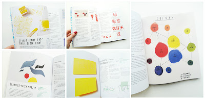
On my Coffee Table: Print Workshop


Another fairly new addition to my bookshelf – I have just got around to reading it properly instead of just flicking through the pictures!
This book is visually interesting and is beautifully put together with lots of photographs and illustrations, it is printed on a thick matt paper which makes it feel very sturdy.


Full of useful information and ideas written in a light-hearted way which makes for very easy reading – I especially enjoyed the the introduction to each chapter and the beginning of the book where is describes the tools, materials and has information on colour. Chapters include relief, stencil, sun and image transfer printing.

I probably wouldn't make any of the projects in the book but I would use the printmaking techniques described. It makes me want to print more though which has got to be a good thing!

Wednesday 16 November 2011

Pikaland Bootcamps


A huge thank you to Amy and Jamie at Camp Pikaland – in just 10 weeks I have transformed from struggling to find the focus to produce and finish artwork, to discovering new and exciting paths towards fulfilling dreams I didn't even know I had!!
 
The first bootcamp was Making your Mark and was a six week course aimed at finding and developing your voice as an artist. I tried lots of new approaches to creating work, homed in my style and skills, and learnt a lot about my strengths and weaknesses. Doing the courses online means are in a group of people from all over the world – they were all in the same situation so you get to learn from each other too. Here is a snapshot of some of the work I created on this course...


In the four week Bringing your work to market I have designed a banner, written an artists statement, photographed my artwork, started this blog, created a website, facebook page, online shop....the list goes on! But each task was geared towards getting our work noticed online in the best possible way to make our work shine.

Camp Pikaland has given me the push I needed and I don't regret joining the courses for a second despite all the hard work! ;) I found Pikaland at just the right time and really feel I am back on track and exciting about making artwork again.

After an intense 10 weeks I need a bit of time to reflect and develop parts of it that I enjoyed -  but I plan to do more courses in the future. I would recommend these online classes for any artist whatever stage they are at – there is always room for improvement!

Saturday 12 November 2011

Art Technician Insight

Being creative is a bit of a juggling act for me. I balance my artwork with a full time job as an Art Technician in a busy secondary school. For most people my job is a mystery and I often get asked what it involves. As part of an ongoing series of blog posts I'll give an insight into the daily life of an Art Technician.

Prepping for a Monoprinting Lesson.

We have roughly 24 students per group so most jobs I do are x 24. For this lesson the students needed 2 sheets of A4 each, one sheet of brown parcel paper and one cartridge paper. This is my work desk with piles of ripped tissue paper in various colours ready to stick down to add a splash of colour to black monoprints.


Next job is to stick down 2 or 3 different colours per sheet with a slight overlap, when the tissue paper overlaps it create new colours. Pritt-Stick is my glue of choice for this after trying many types it's the quickest and the least messy.


I always finish off a job like this by wrapping a strip of paper around it and writing on the front. There are 3 reasons for this – it keeps the paper together until it's needed, it helps me and the teacher remember what it was for (I often do these jobs way in advance) and it also stops other teachers taking it and then you have to do the job again!


*UPDATE*

Here are some of the Monoprints in progress and some of the finished ones.
The students were working on a project on patterns and colour.


Wednesday 9 November 2011

On my Coffee Table: Patterns

I'm addicted to buying arty books! I have 2 bookcases full of them yet I still need to buy more! The latest in my collection is a cute little chunky book called Patterns by Philippe de Baeck. I bought it from Amazon for just £7.06 – Bargain!


It contains page after page of interesting and unusual patterns on different themes such as Inspired by nature, Animal world and my personal favourite Kaleidoscope. The designers name is at the top of each page with their website address. Not every design is to my taste but this is a great pattern resource book that I can see myself flicking through a lot for inspiration. I was drawn to these pages...

Saturday 5 November 2011

Inspiration from Polka and Bloom

I came across Carina of Polka and Bloom when I was looking for embroidery patterns online about a year or so ago. For me her patterns really stood out, her colour combinations are so inspirational and I love the creative use of stitches and intricate designs which are inspired by folk art and the design of her native Denmark. I have bought and made several patterns and have enjoyed sewing every single one.


Carina also runs online classes - I have done two of them, Christmas Stitches and Colour,  both were really well put together with a lot of time and effort. She is very helpful and generous with her knowledge with clear instructions and lots and lots of pictures which is important for visual people like me!


I love to follow what she's up to through her Craftblog – she is a wonderful blogger with interesting and clear to read posts featuring giveaways, work in progress and interviews.

Wednesday 2 November 2011

New beginnings

Thanks to the Pikaland Bootcamp I am now online and have set up a blog!
I’d like to take this opportunity to welcome everyone - I'm very excited to share my work and connect with like minded people.

For my first post I wanted to share a bit about myself and my work. I usually work with paper, constructing 3D pieces, collage, printmaking onto or making artists books. Recently I’ve been exploring compositions using transparent coloured shapes using a light box. I am very interested in movement and want to draw your eye in and around my work. It is as much about the process as the end result – I like a hands on approach using trial and error. A lot of mock ups are made during the process until I have found the right materials to use.

I really hope you enjoy my work as much as I enjoy creating it  - here is a sneak preview of my how I create my work.


The themes I've been working on have been about light reflection and movement in dance. Based on drawing and research on the theme I cut out shapes from coloured OHP acetate and arrange on the light box. I take lots and lots of photos of as many different compositions as possible with the range of shapes. Because of the transparency the overlapping of shapes creates new colours and depths of tone.

Next I use Photoshop to enhance the best images and correct the yellow cast from the light box.

The image is then printed out onto a smooth gloss paper, and cut again around the shapes using a scalpel. I mount it onto 350gsm ivory watercolour paper using 3M Photomount Spray adhesive. I really enjoy the contrast between the smooth raised print and the textured heavy paper.


I have framed this using a light wooden box frame with no glass. 
The work is raised up from the mount using two layers of foam board.